
Page 41 - 2025 Communications Plan
P. 41
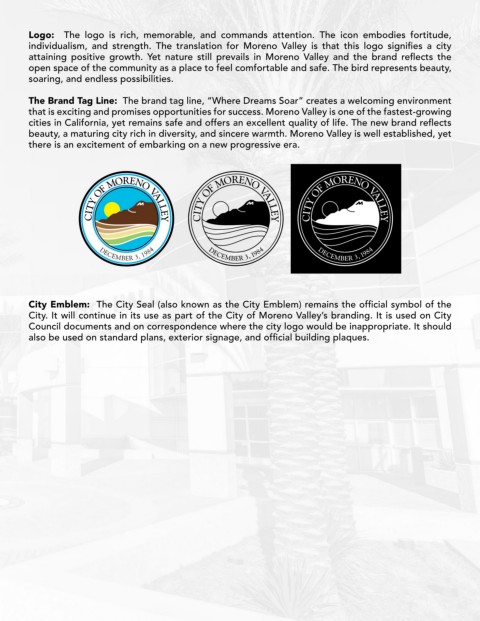
Logo:   The logo is rich, memorable, and commands attention. The icon embodies fortitude,
        individualism,  and  strength.  The  translation  for  Moreno  Valley  is  that  this  logo  signifies  a  city
        attaining  positive  growth.  Yet  nature  still  prevails  in  Moreno  Valley  and  the  brand  reflects  the
        open space of the community as a place to feel comfortable and safe. The bird represents beauty,
        soaring, and endless possibilities.

        The Brand Tag Line:  The brand tag line, “Where Dreams Soar” creates a welcoming environment
        that is exciting and promises opportunities for success. Moreno Valley is one of the fastest-growing
        cities in California, yet remains safe and offers an excellent quality of life. The new brand reflects
        beauty, a maturing city rich in diversity, and sincere warmth. Moreno Valley is well established, yet
        there is an excitement of embarking on a new progressive era.


        City Emblem:  The City Seal (also known as the City Emblem) remains the official symbol of the
        City. It will continue in its use as part of the City of Moreno Valley’s branding. It is used on City
        Council documents and on correspondence where the city logo would be inappropriate. It should
        also be used on standard plans, exterior signage, and official building plaques.